Hello there~
I just can’t help complaining about this, although it doesn’t cause any usability problems. Now look at the picture shown below:
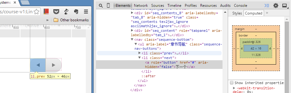
I think that’s enough for a web developer to realize what’s the problem and how does it happen, the bounding box of <a> is not of the same size of it’s parent <li>, whose background is actual image of a button that user would like to click.
All I want to do is apply following CSS style to <a>: ‘padding: 0; height: 100%’.
Now it looks better, at least in Chrome 40 and IE 11 on Windows 8.1…
